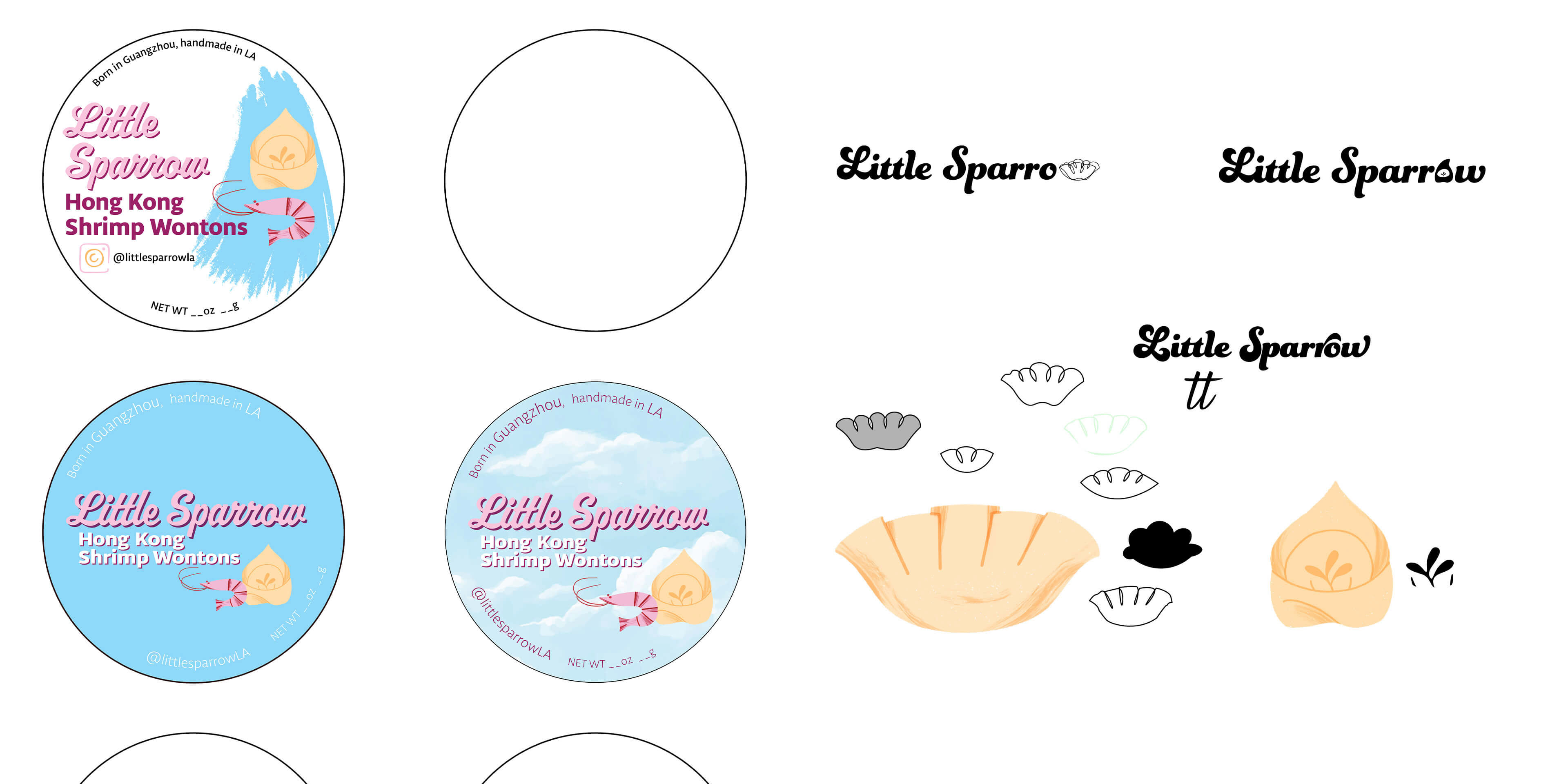
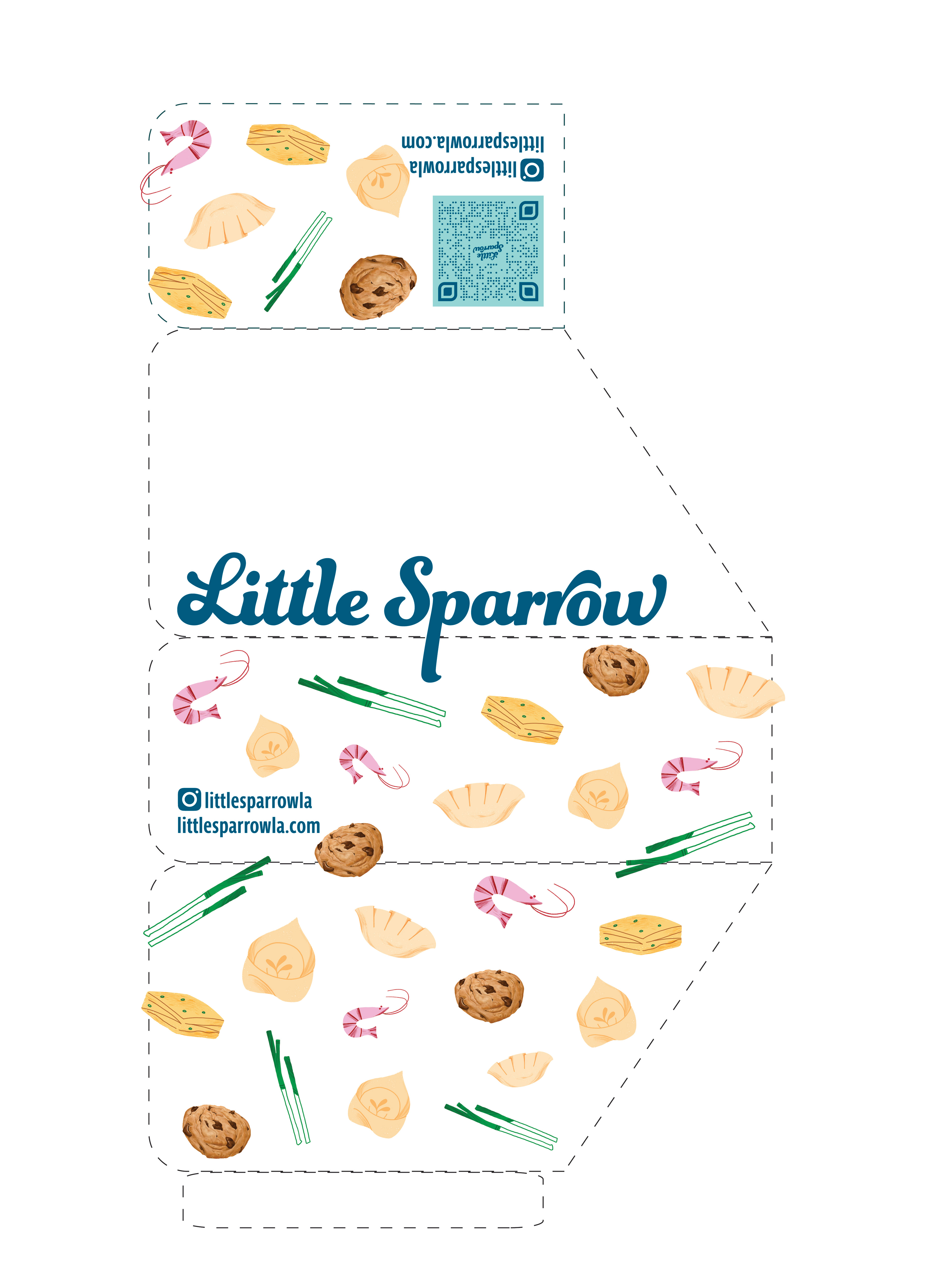
Here's a look at the development process. Initially we considered using a cloud graphic background with pastel colors and entertained replacing certain letters with dumpling and wonton shapes.
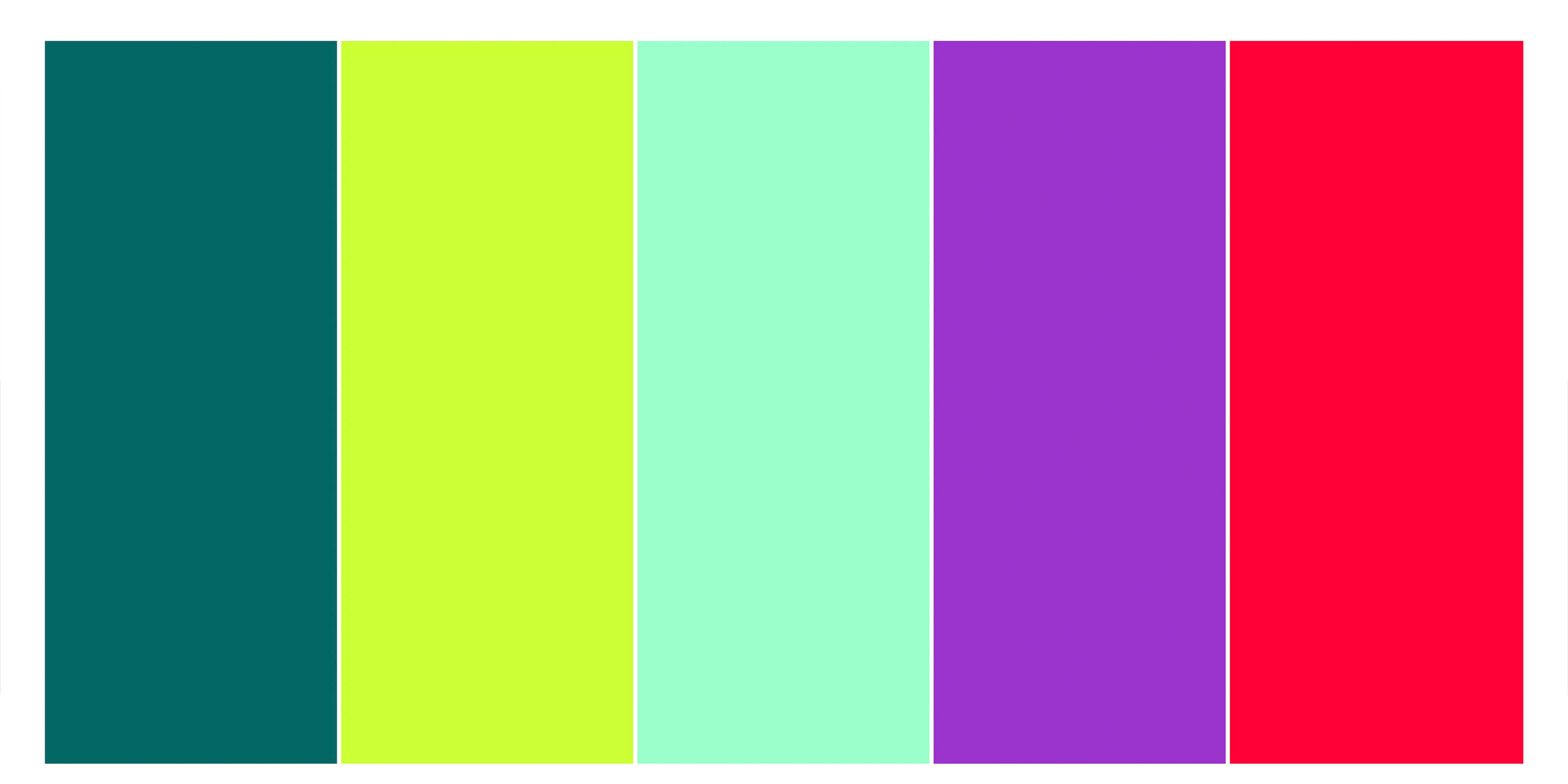
We chose a bright, funky color scheme to mimic the bold unique flavors of the products.
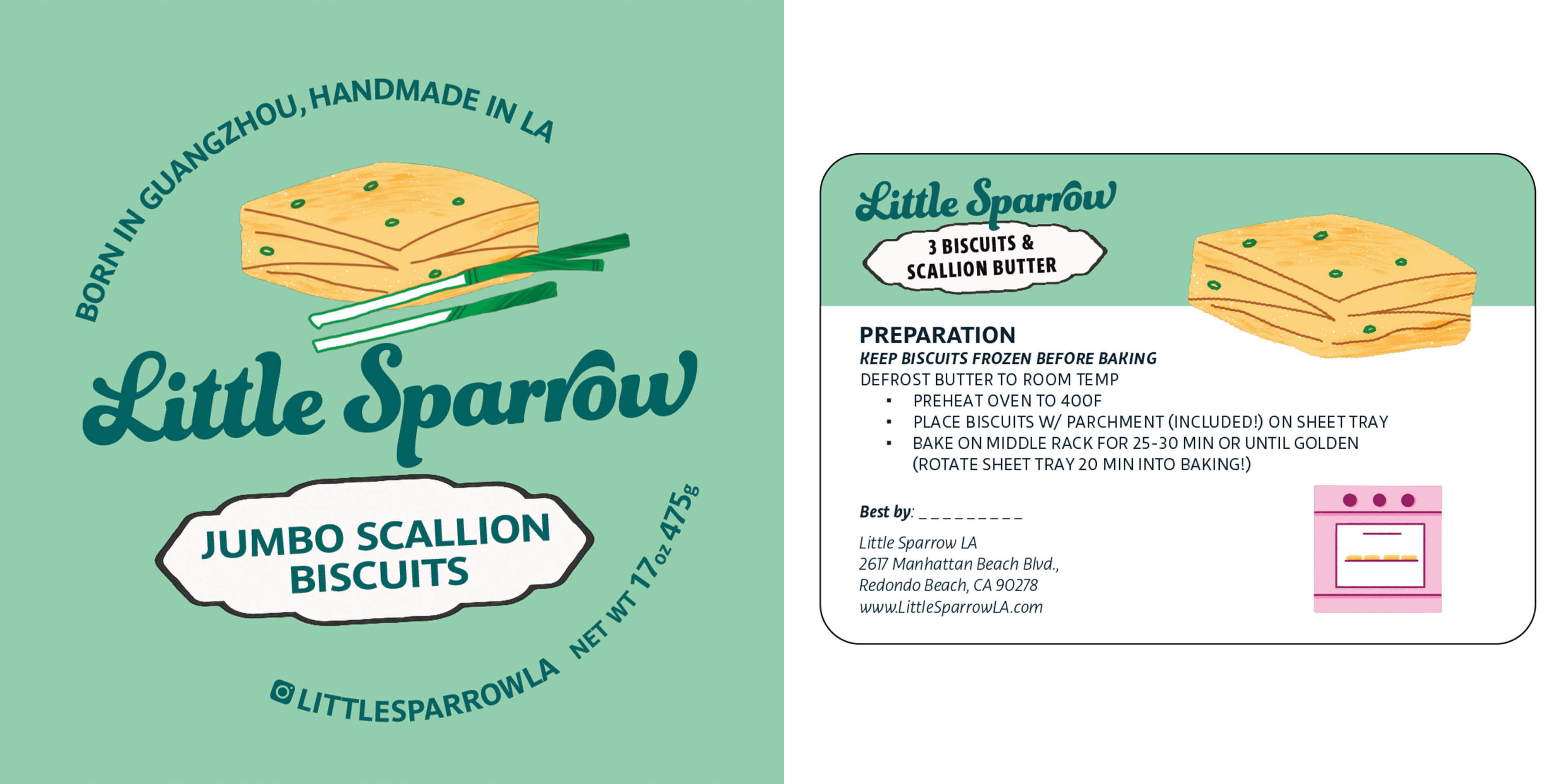
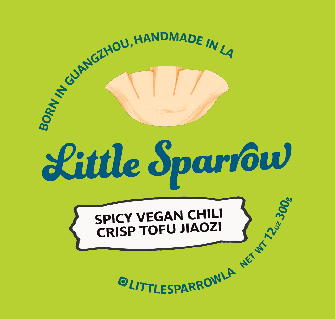
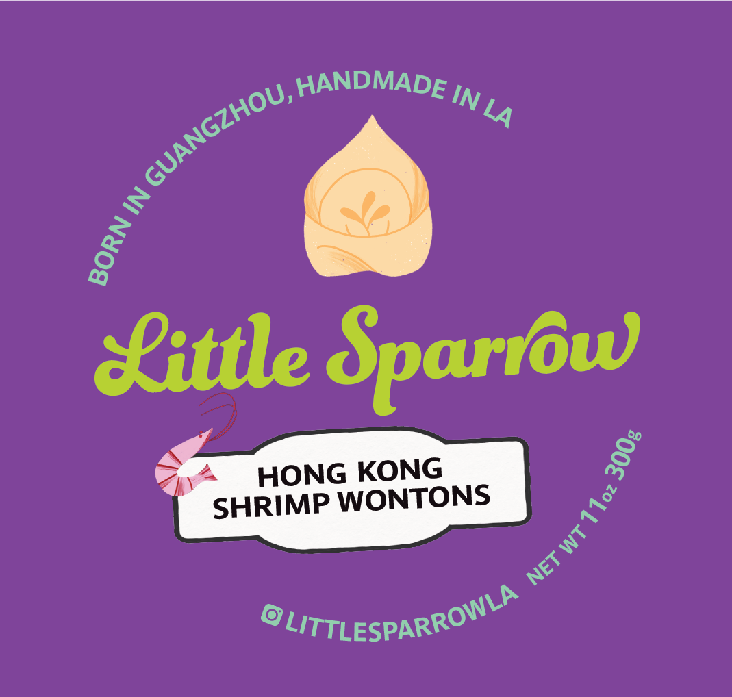
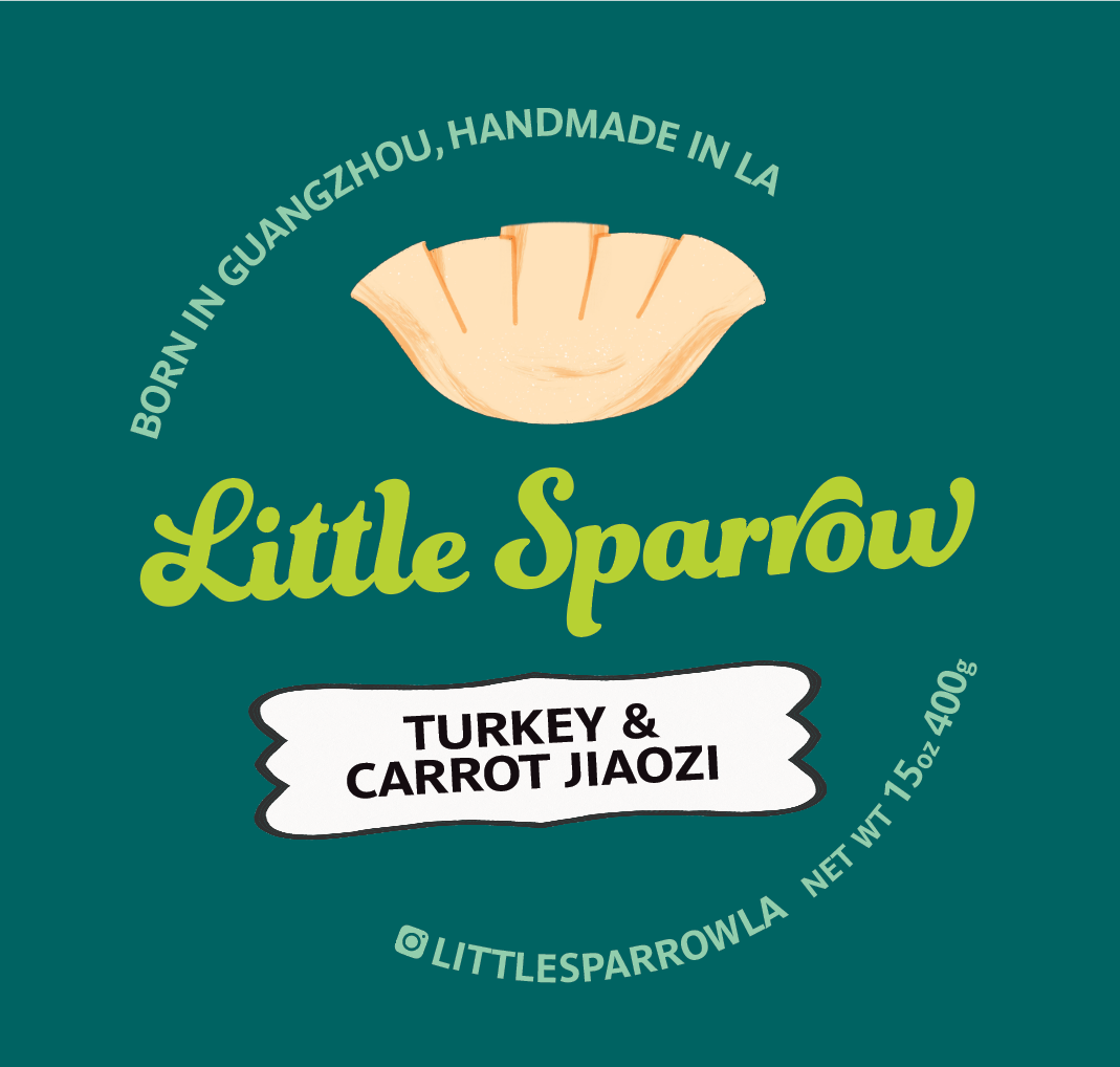
These are the print labels I designed with variations for each product package.
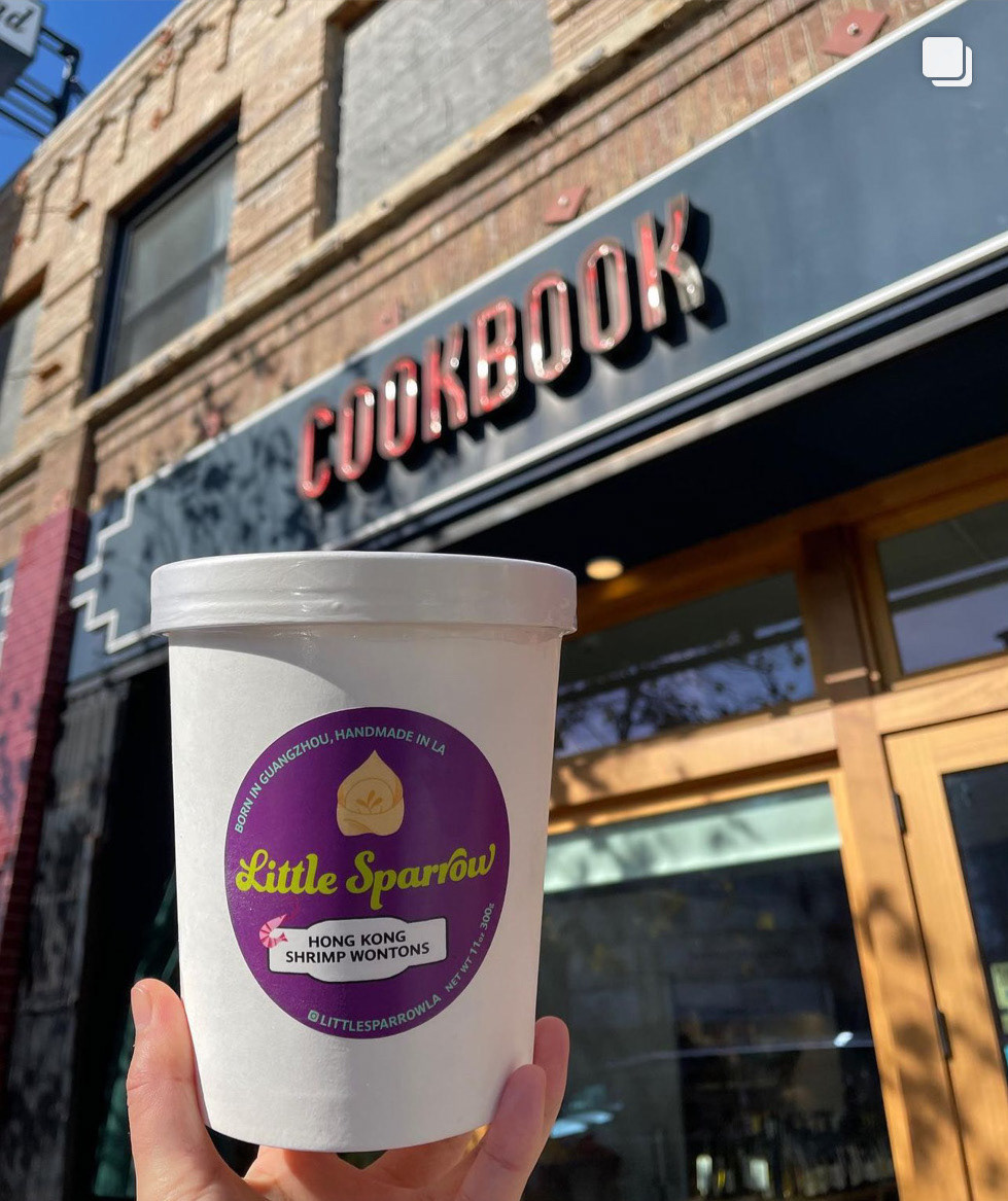

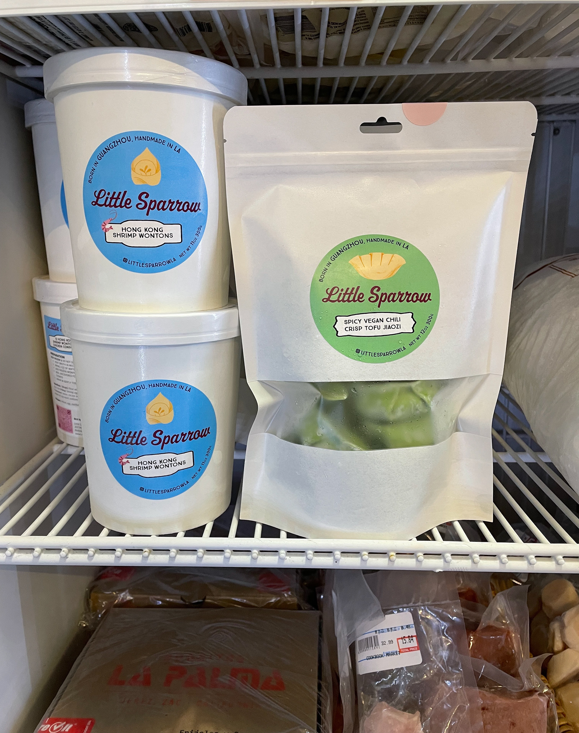
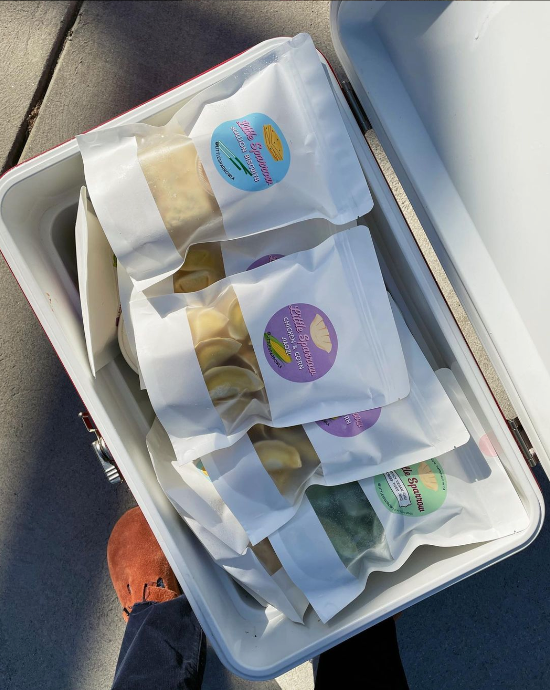
Are here are the finished packages in stores!
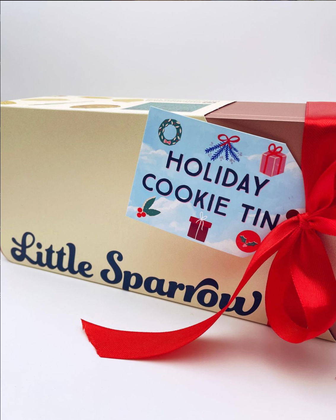
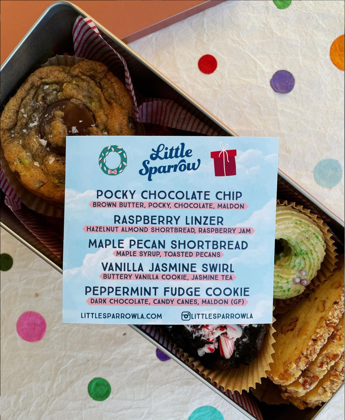
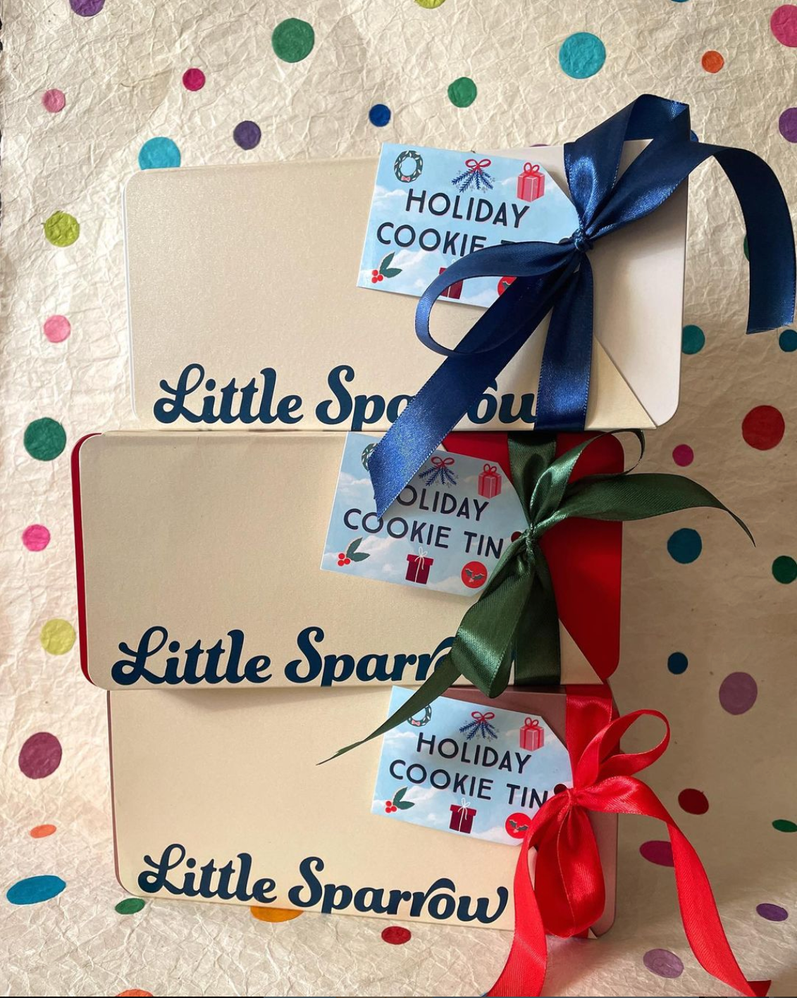
We also did a Holiday Cookie Tin with special packaging.